The importance of packaging
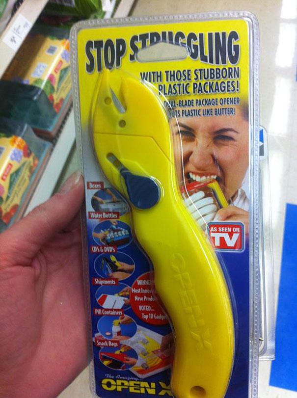
Software companies spend tremendous time and money on fine tuning the landing page of their app or website because it’s the first thing users see and interact with. You only get one first impression, and users will decide how they feel about your company and product very quickly. Hardware products have an analog to this: packaging. It’s the first thing that users interact with and can reveal a lot about a company. Most people have probably encountered packaging like this at one point:
For example, this packaging, in addition to being ironic (possibly on purpose for marketing reasons?), says to the user, “I hate you”.
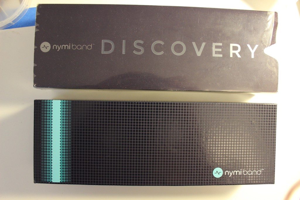
Let’s look at another example of bad packaging. This is the Nymi band, which is a wearable device that lets you authenticate services on your computer or phone using your unique heartbeat.
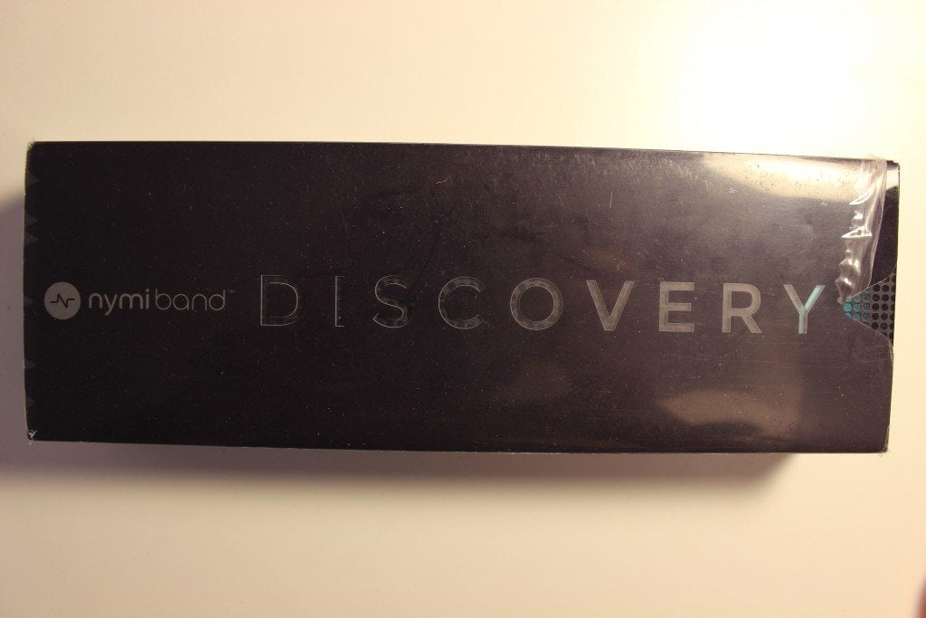 There is an outer plastic sleeve that slide off.
You can already tell this is an expensive package. The sleeve is multi-colored plastic, and the box is quality cardboard with glossy, multi-color text. The lid has magnets embedded in the edge so it snaps into place.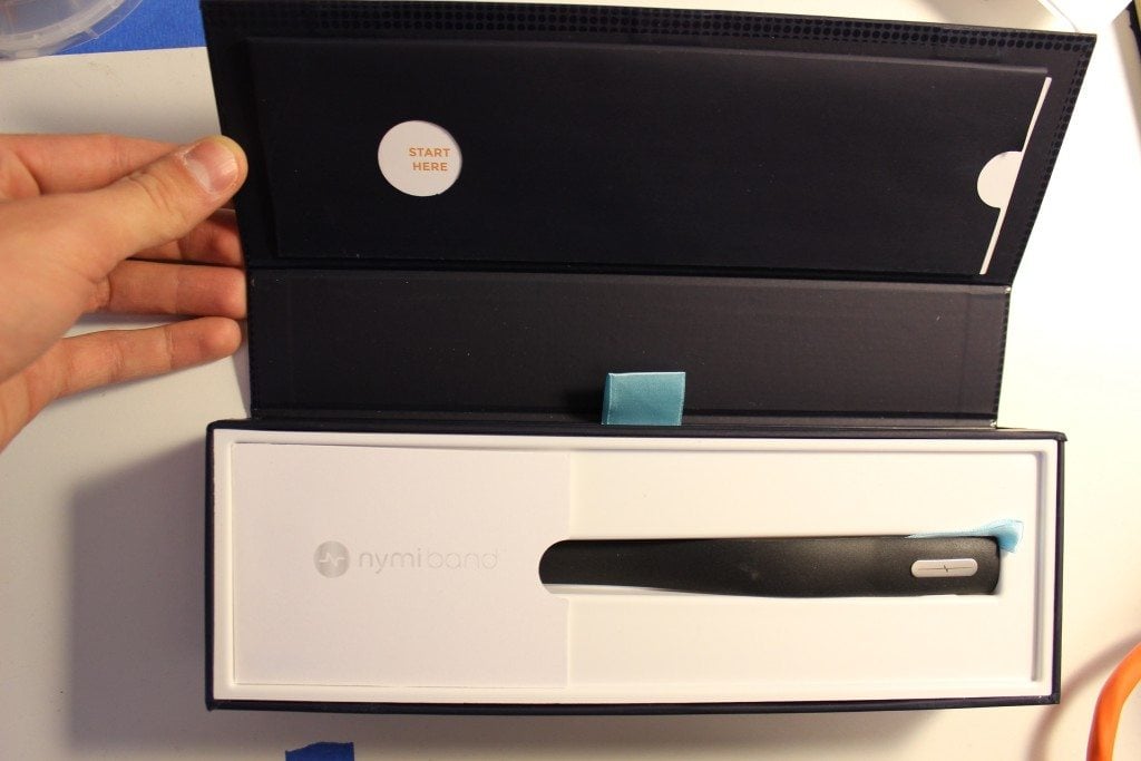
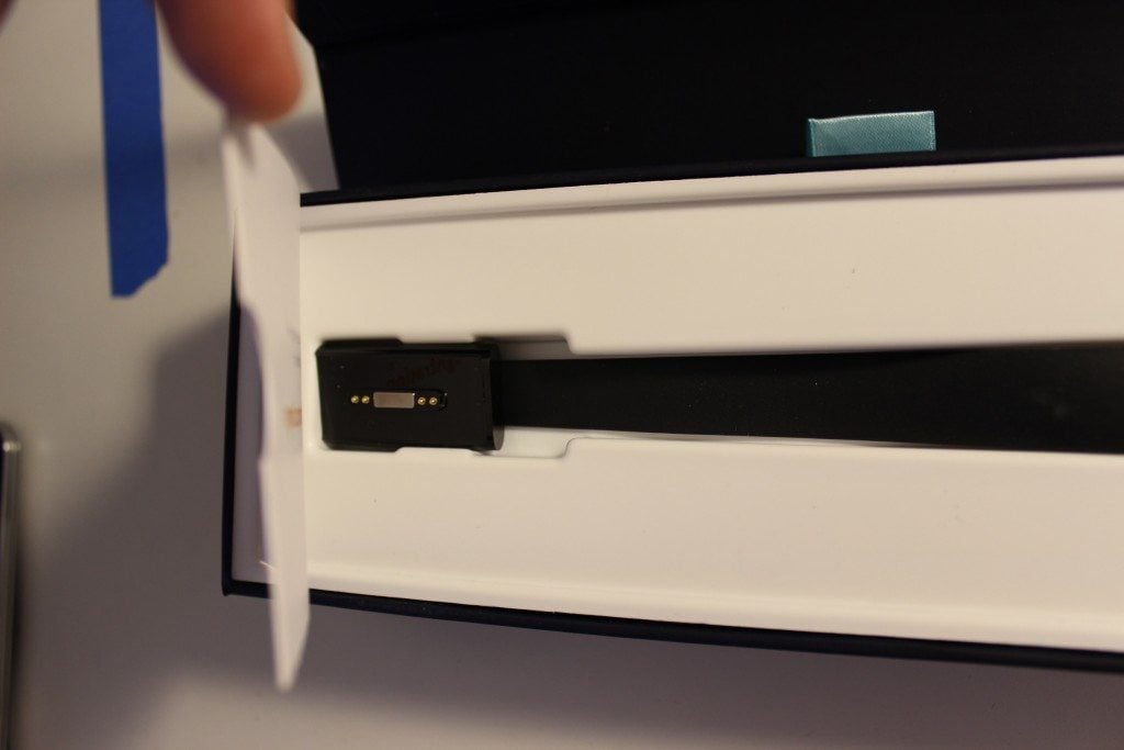
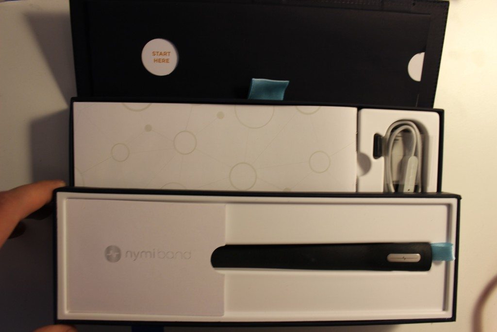
There’s a little “Start here” card in a sleeve under the lid, which has instructions for how to connect the device and begin using it. There’s also what looks like a card lying on top of the band itself and several blue ribbon tabs that look like they should be pulled.
However, the card is actually fastened down at one end, but there’s text printed underneath it. So the little tab cutout cues the user to lift the card, but you feel resistance at a fairly shallow angle, which is confusing because you expect to be able to remove it. To read the text underneath (which has registration instructions), you have to physically turn the entire box on it’s side. The ribbons also present false cues.
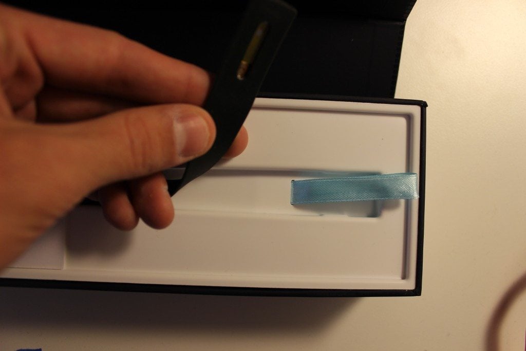
When first opening this, I thought that I should pull on the ribbon to lift the white plastic insert. I knew there should still be some cables and instructions somewhere, and I actually broke the packaging by accident by lifting on this ribbon. This ribbon is actually supposed to be used to lift the end of the Nymi band, since it is held in place by small plastic tabs. However, the spacing isn’t quite right, so the band doesn’t really snap in place there, and I was able to remove the band without using the ribbon at all. The second ribbon is also confusing.
It’s actually the handle to a drawer that contains the cable and directions. The problem is that the drawer is on the hinge side, which means you have to flatten down the box or else you can’t pull it out. This also means that the two ribbons that are the same color have two different actions associated with them: lifting and pulling.
The Nymi packaging left me feeling confused and disappointed that I accidentally broke part of the box, which is clearly design to also serve as the long term storage location for the Nymi band. It’s clear that they spent a ton of money on this packaging because it has a lot of different materials, it’s a quality construction, and there are lots of different kinds of printing in different colors and glossiness. This could be turned into a really great package pretty easily. The ribbon under the band should be removed, because it’s not needed and is confusing. The drawer should be on the side away from the hinge, so that when the user opens the lid, it’s immediately clear where the other compartment is. And the card should not be attached to the plastic tray, or should be removed completely. The registration information can be added to the instruction book.
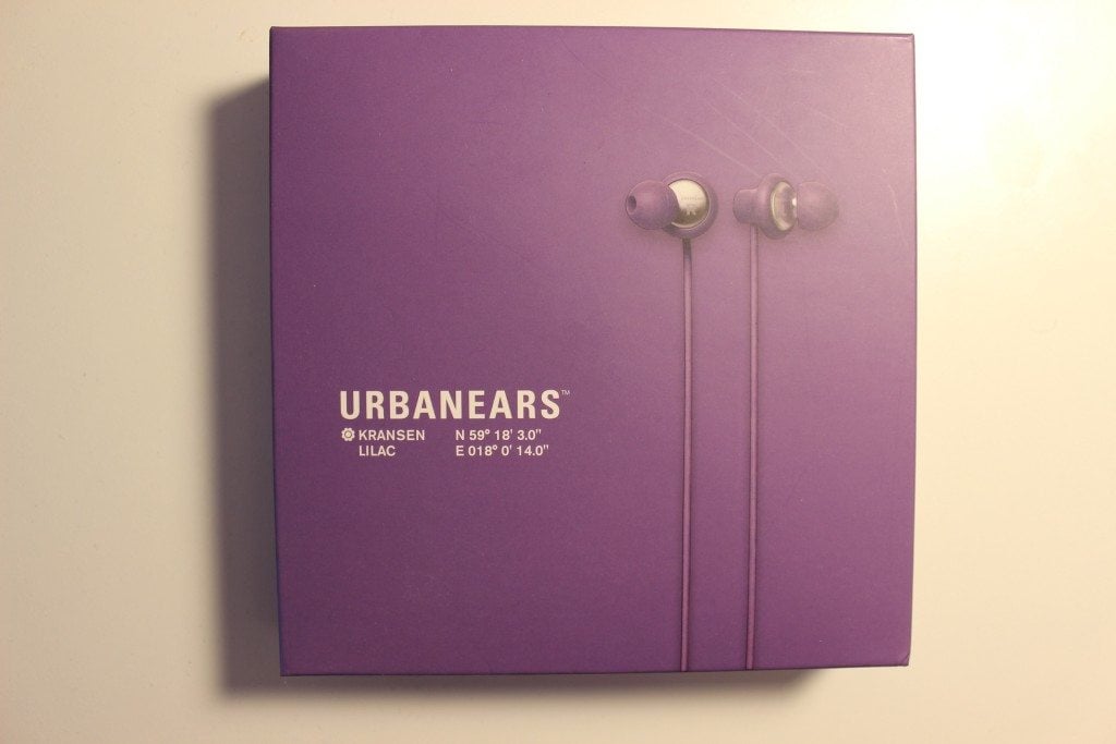
Now let’s look at a couple examples of good packaging. First, UrbanEars earbuds.
This is a two part cardboard package with full color printing.
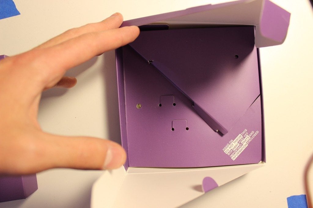
 Once you lift the lid off, you can see that the bottom is made of one piece of cardstock that’s been folded. The square motif is continued here, and there are a bunch of flaps that fold open.
The earbuds themselves fit in those little slots on the bottom, and each flap that folds open is held to the layer below it by a vertical flap. This makes it easy to open and close again without bending or tearing any of the flaps. There’s also some text to tell the user that there’s instructions underneath this last flap.
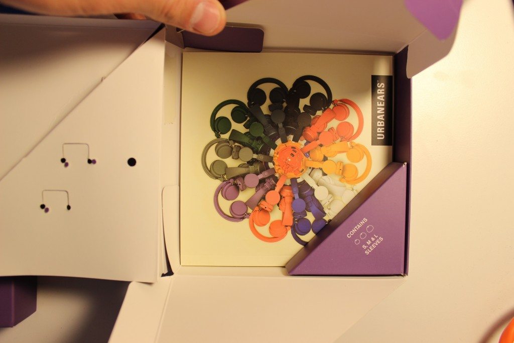
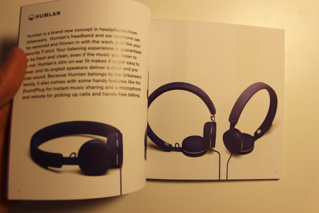
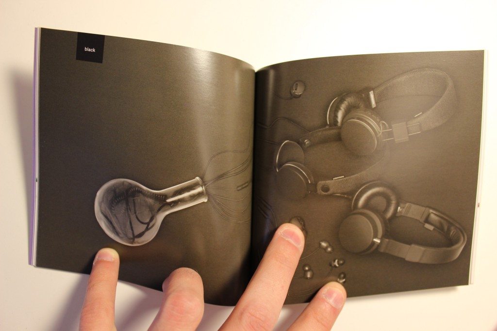
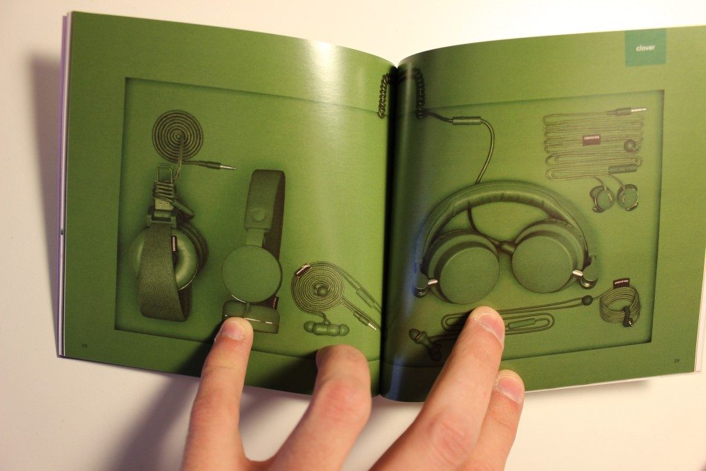
Good design shouldn’t need labels, you should be able to cue the user with the design itself, but I like that they realized people might impulsively take out the earphones and throw the rest away. Above the instruction book is a little triangular box that holds other earbud sleeve sizes for differently sized ears. Most earbuds just come with a single replacement sleeve, so I like that they included different sizes here. The instruction book has some really nice pictures in it and continues with the aesthetic of the packaging.
I like this package because it’s simple, but still has a nice aesthetic. It’s clear what to do, and doesn’t make the user feel stupid or frustrated. It’s clear the designers thought about the package opening experience. On top of all of that, they made the entire thing out of folded cardstock, which reduces the cost compared to a molded plastic package. I also really like the use of color and the fact that there is a motif of squares and triangles down through the entire package.
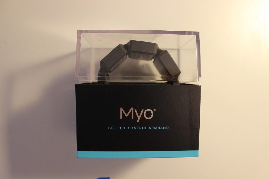
The last example of good packaging I want to look at is the Myo band by Thalmic Labs. This is an electromyography arm band that can be used to control your computer or phone.
It’s made of cardboard and acrylic, with three color printing on the outside. You can clearly see the band itself, so when this sits on a shelf in the store or your house, it acts as it’s own miniature display case.
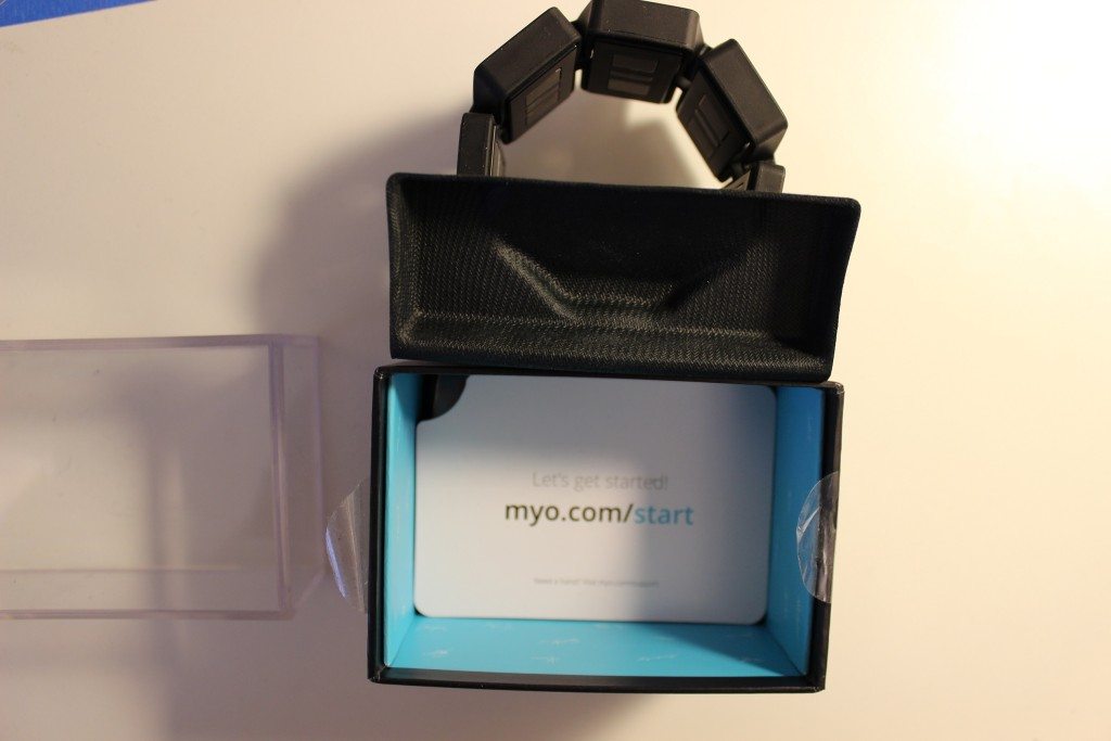
The acrylic is a surprisingly thick 3mm. The band is held in place with a cardboard insert that keeps it from falling and hitting the clear lid even if it’s turned upside down. To remove it, you pull out the insert and fold it open. Underneath is a card with the URL for setting up the band. Notice that is has an almost identical tab for your finger as the Nymi band, but this cue isn’t confusing, as you can actually lift out the card.
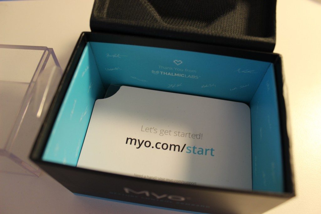 They’ve also printed the signatures of all the employees on the inside, like Apple did on the original Mac. I thought that was a nice touch and helps to convey that this was made by a small group of people who cared a lot about it. It helps humanize the company a little, I think. And I’m sure it made everyone who worked on it really proud, in addition to acting as sort of a guarantee of quality, because their names are literally on it.
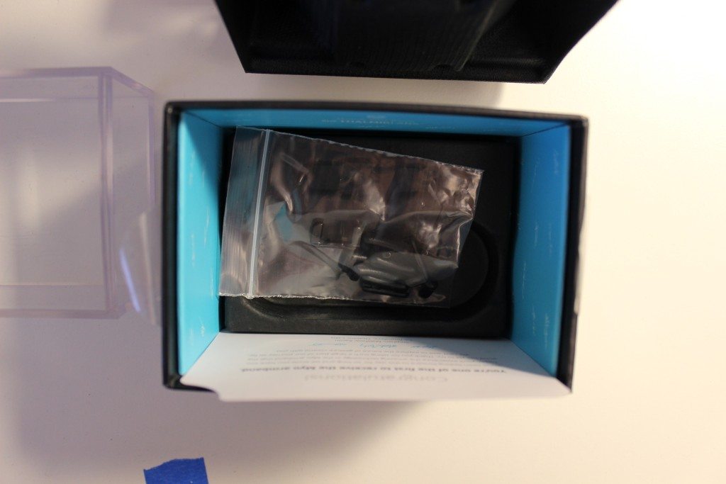
Under the card is a plastic bag holding extra parts for changing the size of the band for different sized arms. It also holds the Bluetooth dongle and cable (not shown in this picture). One of the things I liked was that the cable, Bluetooth dongle, and packaging all had the exact same shade of blue even though they were most likely produced in different factories. Like the Nymi band, the packaging doubles as the storage location. It wasn’t cheap, as they used multiple materials and printing colors. But it’s simple and uses a good construction quality.
If you’re working on a hardware product, don’t overlook the packaging. Think about the role the packaging will play in your product and watch people try to open it to inform your design. Nymi clearly spent a lot of time, money, and effort on their packaging, but they didn’t watch people use it, so they ended up with a bad experience. UrbanEars probably did watch people open it, because their design actively tries to prevent mistakes like throwing away the manual and extra ear sleeves. Packaging can make a big difference in what your users think about you and it’s an often overlooked part of the experience.

2 Comments